Why Too-Perfect Art Is Losing Its Appeal, and the Trend Taking Over Children’s Books
What “textured digital” means, and how to find an illustrator who does it. – The KidLit Creator’s Chronicle – Issue #65
Children’s book illustration is changing, and you need to know about it or it can hurt your book’s success.
For a while, a very clean, smooth look has been popular, and many came to see that as the professional standard. But over the last while, the industry has started to shift, and now it is going in quite a different direction.
That very polished look is losing its appeal, and people are not as drawn to that style anymore. And with so much AI art around these days, this look can even seem a bit suspect to art directors and to authors who are looking for an illustrator.
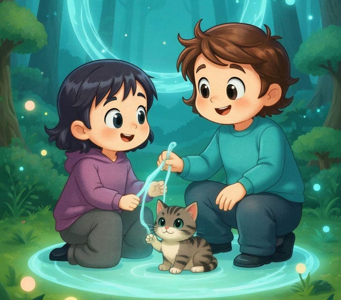
An example of a clean digital style (created with AI, since I didn’t want to use anyone’s work as a “bad” example). Ignore all the extra legs and other strange things (or laugh at this perfect example of what happens so often with AI art).
“Textured digital”
The thing the market is now looking for already has a name that publishers use, and that name is textured digital. Textured digital is art that looks handmade but is finished digitally, so you get the look that tells your eye a person made this, but it’s still digital (but not AI!). Some in the industry are calling it the biggest trend in children’s book illustration this year.
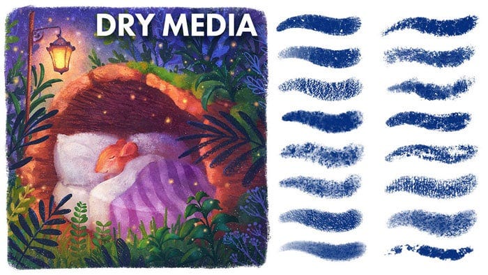
Credit: Madelein Bellwoar
With all the “perfect” digital art and now the rise of AI art, the imperfections of human art has become a kind of trust signal, because it tells a parent that a person made this and that care went into it, which is what they want for their child.
Texture is not the only thing. Softer palettes are also trending, with muted pastels and gentle tones featuring widely. I believe this trend stems from the same reason, which is calm, human-feeling art vs the machine-made look. I wrote more about this comfort mood in a recent edition.
How to get the textured digital look for your children’s book
First off, textured digital sits on a spectrum and your illustrator can work anywhere along it.
At one end, the art itself is mostly traditional. The illustrator paints or draws with traditional media (on paper/canvas), and will often create the backgrounds, characters and other elements as separate pieces, then scan them all in. From there, they work digitally and arrange the elements, change colours, add detail and tweak things to create the final scenes. So you get real traditional media on the page, but working digitally makes it much easier to edit, and it gives them a lot more flexibility across a whole book.
At the other end, the work is created entirely in Procreate or Photoshop, but the artist brings media texture into the digital artwork. Some do this themselves, painting or scanning their own watercolour or paper grain and laying it over or under the digital work, or to create their own custom brushes that look like traditional media. But the reality is that most of us use (overlay) textures and textured brushes made by other artists. These brushes are built from scanned traditional media like watercolour, crayon, pencil and charcoal, and there are some wonderful high-quality packs out there. I use Lucy Fleming’s and Adilson Farias’s, for instance. Someone else did the work of creating those textures, so I don’t have to. The finished piece carries genuine media texture, but it is a digital file, so you get easy revisions.
Both ends of the spectrum give you a handmade feel with digital flexibility.
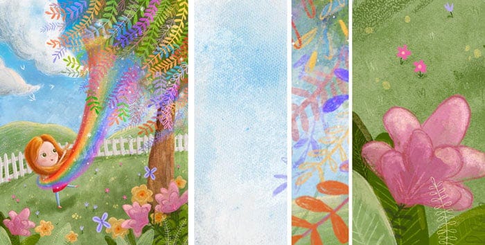
A fully digital example from my upcoming picture book, with close-ups of the canvas, watercolour and crayon textures.
These kinds of real scanned brushes and overlays have been part of digital illustration for years. Illustrators can buy texture brush packs, gouache, watercolour, chalk and coloured-pencil brushes, and scanned paper textures to bring a traditional feel to their digital art.
(So you don’t need to ask an illustrator whether they photograph their own paper or paint their own textures. They don’t need to, and the proof is in the pudding–how does their work look?)
Lately I’ve noticed more posts and short tutorials pop up in my social feeds on how to make digital art look hand-drawn using texture packs, brushes and scanned paper. It is possible I am only seeing more of it because of my own social media activity, but I wasn’t seeing so much of this a year ago. It is likely a reaction to how much flat, AI art is now out there.
So when you brief your illustrator, you do not need to ask for traditional media. You can find a digital illustrator whose work has a traditional feel.
Looser, less perfect lines
Apart from textured digital, looser, more organic shapes are also becoming more popular, and part of the same trend. A lot of digital art has perfectly round circles, perfectly straight lines, very clean edges, and characters that can look quite stiff or posed. With a looser style, the lines and shapes are a little imperfect and the characters feel more natural.
Both styles can be done digitally, and neither is better or worse in a technical sense. It is simply a different look. Looser lines feel more human, which is exactly what a lot of the market is drawn to right now.
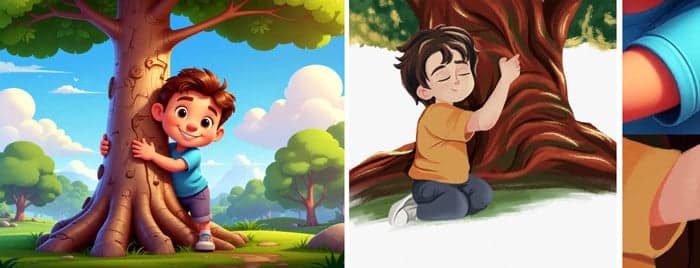
The easiest way to understand it is to see it, so here are two examples.
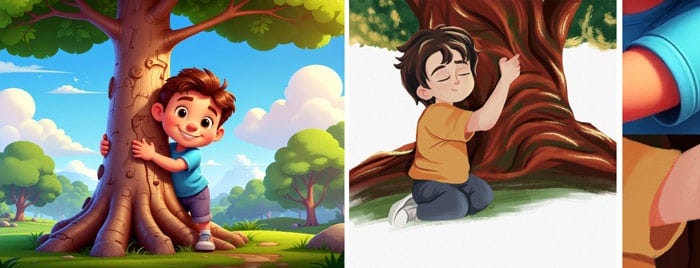
Image 1 is AI. Image 2 is illustrated by GetYourBookIllustrations for Tree Hugger by Gail Schlenger.
The first one is very clean, with perfect or symmetric lines and shapes. It has that slick, machine-made feel.
The second illustration is more organic. You can see the brushwork, the lines and shapes vary and aren’t perfectly symmetrical, and the whole thing feels hand-drawn. The way the boy is sitting feels like a real moment in the story, instead of a posed photo.
Traditional vs digital for your book
There is also a return of analogue craft in the children’s book industry, with woodblock printing coming back, linocut artists being signed to agency rosters, and illustrators who went digital years ago picking up their traditional tools again. It is definitely interesting, and it’s a sign of the reaction to AI and overly polished digital art.
For instance, Chris Wormell, who had moved to digital for his children’s books, has gone back to woodblock, and clients are specifically asking for it.
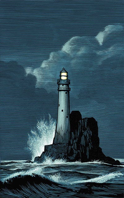
But for self-publishing authors, hiring someone to do linocuts, for example, is usually not feasible (and not necessary). Of course, you can hire a traditional illustrator if your budget allows and you find one you love. But most illustrators work digitally now, so it will be harder to find someone who does physical printmaking, and they’re pretty much bound to charge more (which is only fair, given that they have to buy materials and almost all edits mean redoing the artwork completely).
For self-publishing authors, it’s more realistic to hire an illustrator who creates textured digital illustrations that give you the look that’s popular right now, because traditional illustration almost always costs more.
What you really want is art that was made by a human (and looks like it!), whatever your budget and whoever your illustrator is.
Real-life examples
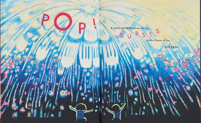
A good example is Catia Chien’s picture book Fireworks, made with mixed media: pastels, pencils, paint and scratchboard. Her book won a 2026 Caldecott Medal. You do not have to copy her method, but you can aim for a similar organic look.
A great example to show digital art achieving the traditional look, look at Lucy Fleming, who has illustrated for Penguin Random House, Bloomsbury, Simon & Schuster, Macmillan and HarperCollins. She does most of her artwork digitally these days, in a mix of Procreate and Photoshop, but she deliberately works in some painterly or scribbled texture, which is textured digital.
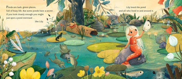
A spread from Lily the Pond Mermaid by Lucy Fleming.
Over to You
What illustration style are you drawn to for your own books? Have a think about the picture books you love and what it is about the art that pulls you in.
Comment and let me know. I love hearing from my readers, and I’ll respond to you.
A quick note
I’m presenting a free live training! Not related to this article, but you are invited!
For children’s book authors, school visits are one of the best ways to connect with readers and grow your author career.
On 15 September, I am running a training on this, where I will walk you through my 5-part VISIT Framework so you know how to reach out to schools and do visits in a way that actually works! Whether you’ve never done a school visit or you just want to book more of them, it will give you the roadmap for how to do school visits that help you sell more books.
Register for the free training here.
Before you go
I recently saw a maker of one of these texture brushes who wrote into his license that you may not use the brushes to fake a handmade look on AI-generated art. There are quite a few movements supporting human art and writing, and this is also moving in that direction fast.
In the end, technique and tools matter, but what matters much more is whether something was created by human hands. These trends show that this is what people want to see, which is a wonderful, hopeful thing for us creators!